Design Review: JKM Web Portal

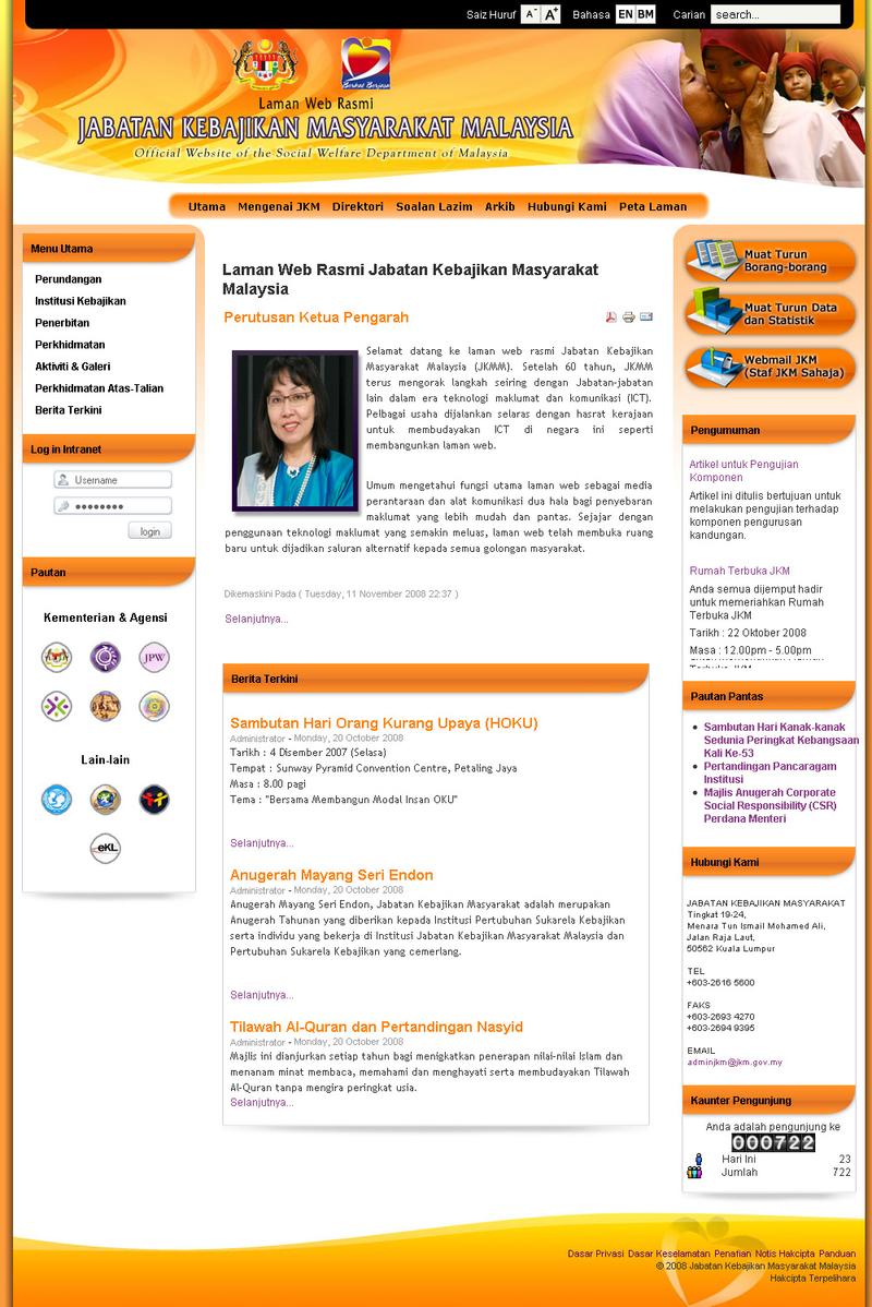
An old version of JKM’s web portal.
In 2008, a younger me joined a local web development company as a web designer. He was just starting out in his career and had only just begun to explore the world of web design and development. His general role was to design UI and convert it to HTML & CSS. At that time, web development using open source CMS was on the rise in Malaysia. PHP and WAMP/LAMP stacks were popular backend solutions, and Joomla! 1.5 was the most commonly used content management system (CMS). The company did not have any other designers on staff, so he worked closely with the developers and other stakeholders to design and build the web portal.
Introduction
The Social Welfare Department (JKM) web portal was redesigned in 2008. The goal of the redesign was to improve the usability and accessibility of the website. This report will review the design of the JKM website and provide feedback on how it can be improved.
Background
The JKM website was first launched in 1999. The website was originally designed to provide information about the services offered by JKM. The website was minimally designed with usability or accessibility in mind. We had a few guidelines from MAMPU which As a result, the website was difficult to use and did not meet the needs of all users.
In 2008, I did an exercise to re-design the JKM web portal.
Design
The new design of the JKM website is a significant improvement over the previous design. The new design is more user-friendly and accessible. The website is now easier to navigate and find information. The website is also more visually appealing.
Feedback
The new design of the JKM website is a good starting point. However, there is still room for improvement. Here are some suggestions for how the JKM website can be improved:
The website could be made more accessible to users with disabilities. This could be done by using larger text, high contrast colors, and keyboard navigation. The website could be made more user-friendly for mobile devices. This could be done by using a responsive design that adapts to different screen sizes. The website could be made more engaging by using more images and videos. The website could be updated more frequently with new content. Conclusion
The new design of the JKM website is a significant improvement over the previous design. The new design is more user-friendly and accessible. However, there is still room for improvement. The suggestions in this report can be used to make the JKM website even better.
Recommendations
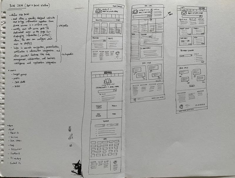
Sketch of proposed solution for JKM web portal review.
I recommend that the JKM website be updated to address the following issues:
Accessibility
The website should be made more accessible to users with disabilities by using larger text, high contrast colors, and keyboard navigation.
Mobile
The website should be made more user-friendly for mobile devices by using a responsive design that adapts to different screen sizes.
Engagement
The website should be made more engaging by using more images and videos.
Content
The website should be updated more frequently with new content.
I believe that these changes will make the JKM website even more user-friendly and accessible.
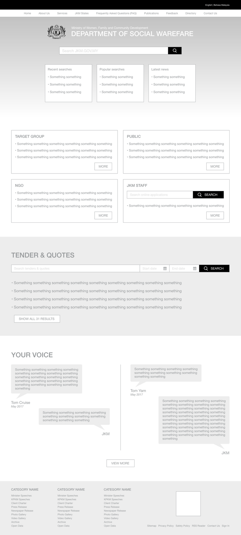
Low fedility design of proposed solution for JKM web portal review.