DXC Bionix Design System
Our team decided to build a design system for DXC Bionix Commercialization effort.
| Project | DXC Bionix Design System |
| Responsibilities | Research, design and build. |
| Technology Stack | Sketch, InVision Design System Manager |
| Year | 2017-2018 |
| Design System Link | https://dxcraas.invisionapp.com/dsm/dxc-apa/dxc-bionix?version=5bcda38e152dd5001a44ed15 |
Summary
Our team was tasked with designing UI and UX for DXC Bionix Commercialization effort. After gathering and studying stakeholders’ requirements, the team decided to develop a new design system using InVision Design System Manager (DSM) to align with efforts from other teams for building screens and prototypes quickly during later development and production phases.
1. Background
I was working in a 4 + 1 members team (we got one team member seconded from another team during later phases of the exercise) where the UX goal is to provide a unified user experience across all components of the DXC Bionix Commercialisation effort. Every team member participated in every step of the design system development process which includes (but not limited to) research, analyse, wire-framing, building and animating design components using Sketch and InVision Design System Manager (DSM).
An important requirement is a set of user experience must be documented and aligned as a standard. Each user interaction should be aligned to a user experience and the variations of user experiences should be limited.
DXC Bionix has a brand guidelines for marketing but does not include UI guidelines for applications.
The interaction (task) accomplished by the experience.
DXC Bionix has a brand guidelines for marketing but does not include UI guidelines for applications.
The capabilities providing that experience.
The dependencies of the experience on the capability.
When capturing a user experience the following items was identified:
Goals
Develop a design system to utilise component based design – need to build fast and iterate quickly during development and production phase.
Non-Goals
To have a comprehensive list of components – the project just started, we will build more components as needed in the future.
Re-invent the wheel – embrace open source and build on top of existing industry knowledge and best practices.
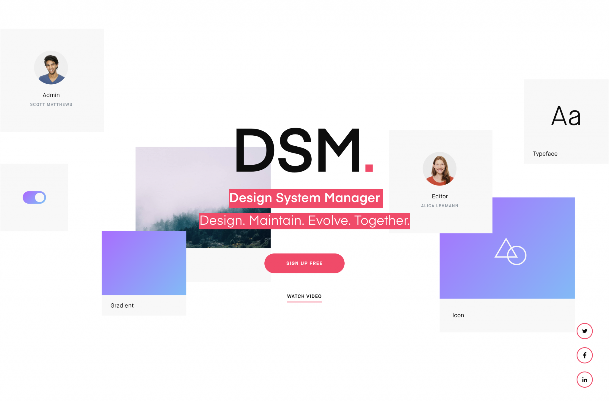
2. Proposed Solution
InVision Design System Manager
Risks
Design conflicts with DXC Bionix brand guidelines as it does not include UI guidelines for building computer softwares.
InVision DSM was relatively new at the time, however it’s the most comprehensive compared to other solutions.
Highlighted Milestones
Having direct access to PM and other stakeholders – quickly come to an agreement on scope and deliverables.
Running mini Design Sprints and utilising tools such as Trello and Freehand to prioritise design and deliverables.
Early discussions with our engineering team resulted in synchronised component-based development between both teams.
Open Questions
- How future-proof and maintainable is this solution?
- Is it okay to use hacks when designing components?
3. Outcome
What we liked
Synchronous design system
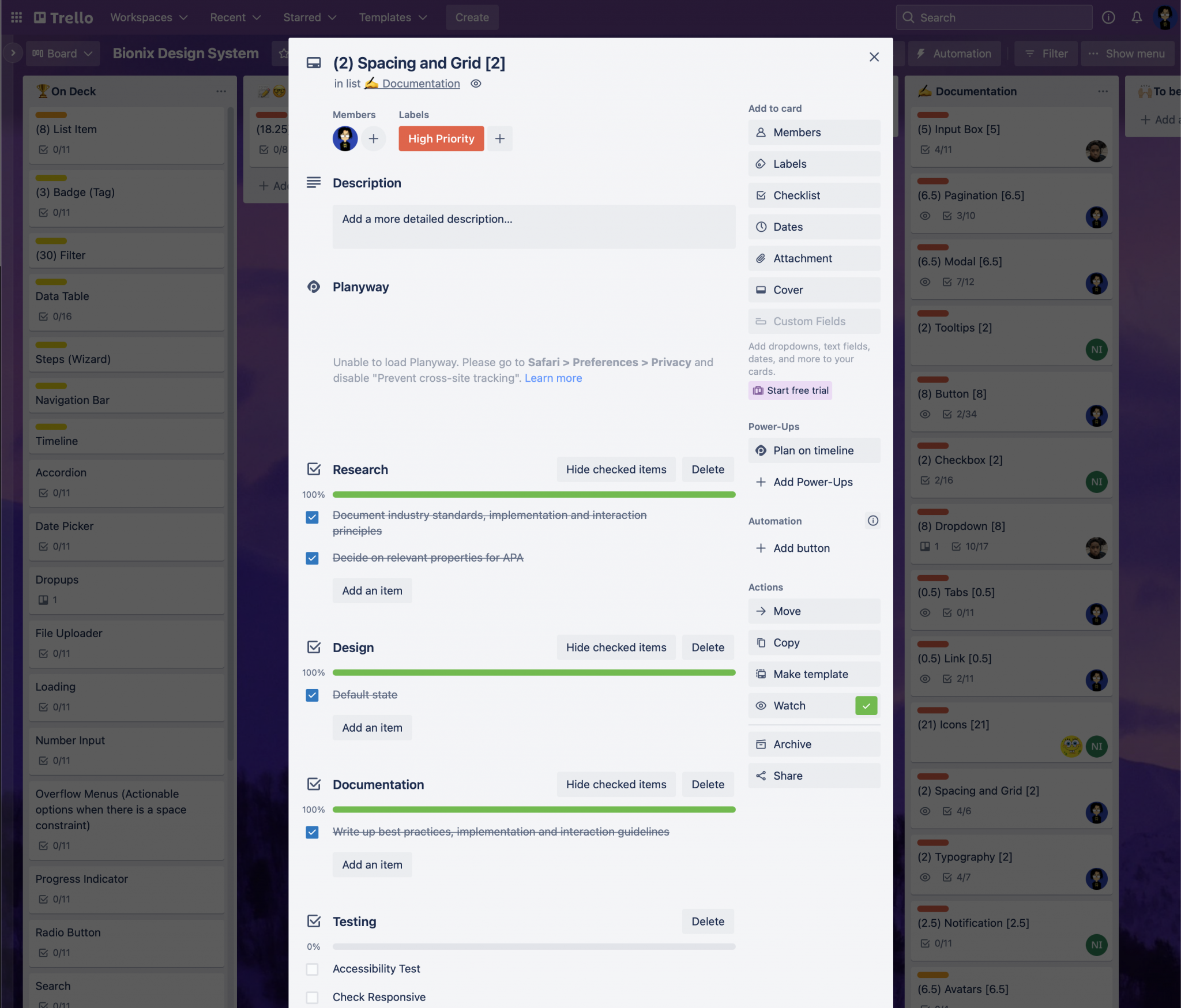
It is easier and faster to produce screens using reusable components. having it integrated into the ui design process helps a lot.
We are able to add actual symbols and components we work with inside of Sketch directly to the Design System. There is no disconnect between the reference design and symbol we use to design. This is a so convenient and a huge timesaver! Prior to this, we were maintaining a paper document and uploading images with spec overlays. Every once in a while, updating a component required significant effort, sometimes leading to disconnects between the reference Design System and design symbols.
Easy to maintain and evolve
This really ties into the first point. The fact that every component update is just a click away really encourages a change in not just the way we work, but the way we think. We run a dual-track agile product design practice. Design is able to evolve existing experiences before the next round of development comes in. We are able to test out hypothesis and deploy learnings quicker.
Applying layer styles
Applying layer styles using DSM—by selecting desired element, then clicking the corresponding style in DSM is pretty handy compared to using the microscopic colour palette in Sketch.
Troubles we had
Local layer styling
Colours are not linked in the DSM library, it just applies appearance locally. If we need to make a global colour change, it becomes a laborious task. Same goes for text styles.
Updating symbols
Downloading a component (symbol) from DSM, manipulating it to create a new component and then uploading the new component to DSM seems to take a long time.
Importing
When pulling a symbol from DSM to Sketch, multiple colours are being imported, even colours that should not have any trace to the current DS. No idea where it is being used. This extends to all symbols, not just colours. We seem to have overrides left and right.
Intermittent upload bug
It sometimes fails to upload and ends up pulling all manner of symbols into the sketch document, making the document really bloated and impacting performance.
Text style organisation
Need a way to better organise text styles – maybe a way to have sub-levels for text styles. At least change the default “The quick brown fox…” text in DSM web to the text style name (like how it is in DSM Sketch plugin)
Mismatched colours
Colours property of some elements — such as icons, in exported mockups (either with Craft or Sketch native) is mismatched. Need to detach symbols in order for it to correctly render on InVision.
The case of the missing font files
Font files uploaded to DSM web keeps disappearing
Multiple nested levels for better organisation
Multiple nested levels would be welcome addition, but not a deal breaker.
Our workarounds
🥳 Sketch libraries, FTW!
We moved our workflow to sketch libraries, and use DSM as a reference point for developers.
We used Google drive to host our library files. Sketch Cloud has syncing issues, needing to restart or re-add libraries almost every time there is an update.
4. Showcase
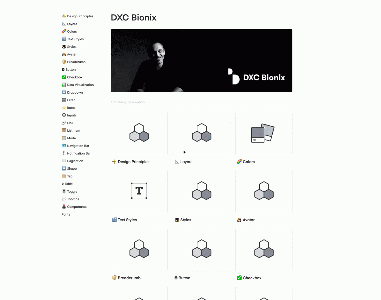
Design Principles
Informed and Evolving
UserHuman needs are in flux. Through informed design decisions backed up by research whenever possible, design should evolve to reflect how real people use the system.
Consistent Interactions
All design components should be part of a cohesive unit that fosters contextual, predictable experiences.
Purposeful Elegance
Bionix should look and feel like a world-class experience. Every aesthetic design decision – from colour to visualisations should be elegantly designed with purpose.
Simplified Complexity
Do the hard work to mask and reduce the complexity for the user. Empower the user through direct and effortless experiences.
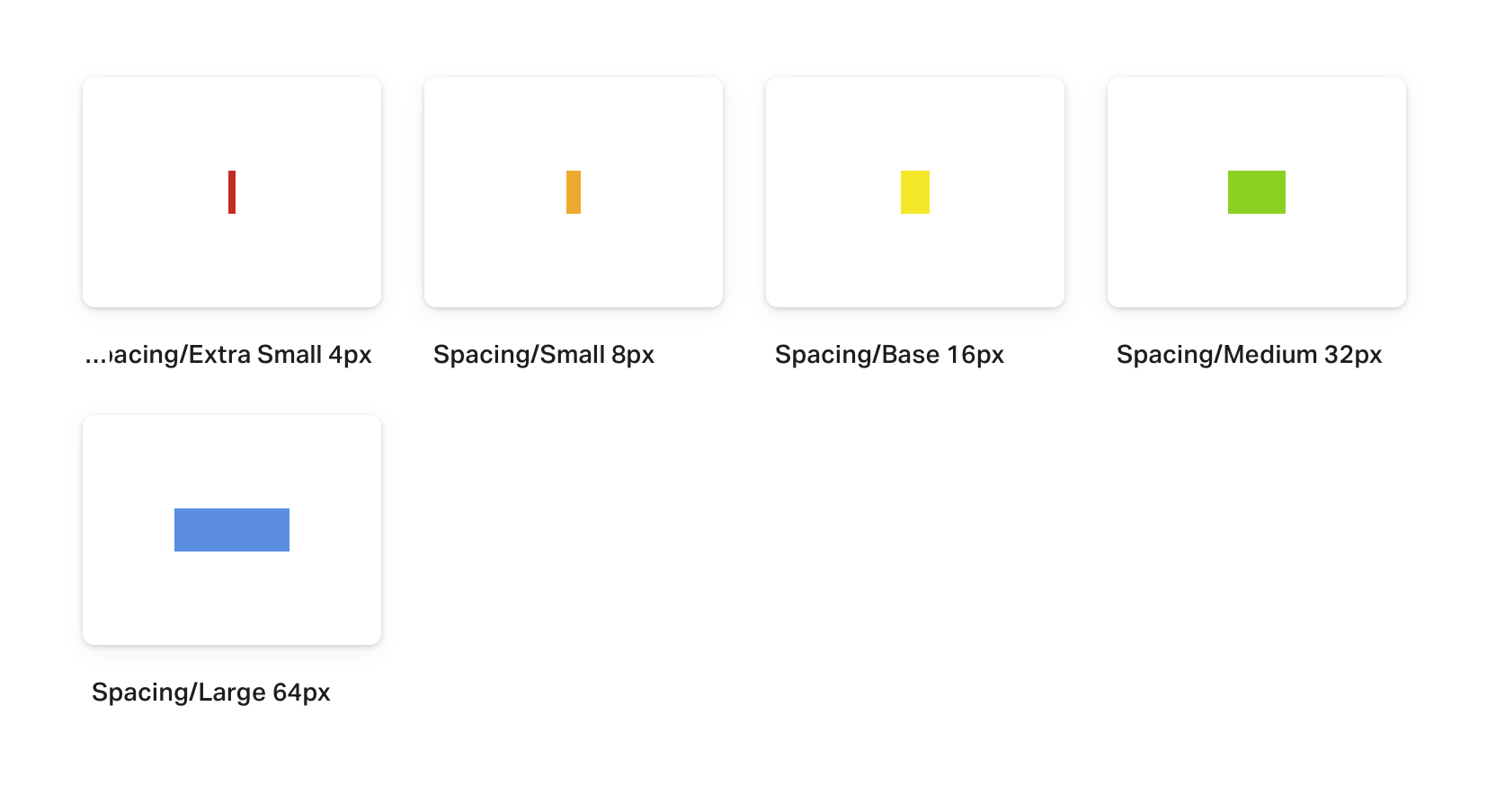
Most collaborators can’t see space, a primary reason it’s so arbitrarily applied. But now we’ve got a system: a limited number of concepts, each offering a limited range of options. -Nathan Curtis